Pages

Showing posts with label lounge. Show all posts

Sunday, 11 December 2016

[Your] Place: A winter update, That's not just for Christmas

It's officially winter here in Blighty; December is in full swing, festive lights are twinkling and the parties are in full swing.

So it seemed very timely to have been encouraged by Jordan at Douglas Elliman’s Florida office to write a blog post that would inspire people to cosy up their homes for the oncoming season.

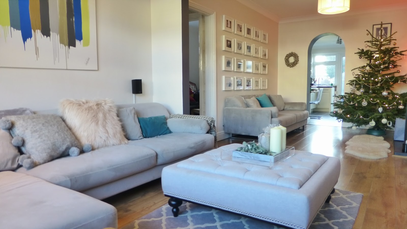
This post has been conjugating in my mind since we first decorated our lounge (you can see the original decor here) which has been designed with a neutral base to allow us to change it up seasonally. 

Many people decorate their homes exclusively for Christmas festivities, but I wanted to create a scheme with a big more longevity that celebrates the beauty of the winter season, lasts well beyond the month of December and could just as easily be implemented in warmer (than freezing) climates.

My first step is always a mood board, a collection of images, textures, materials and photographs that start to shape the feel of the scheme I want to create. Pintrest is such great platform for this. You can see the full board here [Your] Place: Winter Wonderland.

I wanted to create a relaxing colour scheme, inspired by the colours of winter. A palette which creates a feeling of cosy, refined opulence through the use of natural materials and variety in texture. 

I also wanted to bring some of the freshness of the outdoors inside, to create a connection bring in some of the evergreen life and beautiful muted blues and greens of Eucalyptus. 

So here are my easy updates...


1) Cushions & Textiles

One of the easiest updates, with the most impact, is to change the textiles.
When coming up with the original scheme for the lounge I kept the base monochrome and of colour limited to throw cushions and artwork for exactly this reason. 


I've kept our teal cushions but removed the mustard yellow and bright pink for the time being. I've introduced a more muted colour palette of pinks and greys, inspired by the mood board above, and introduced a wider range of texture to keep things interesting and feeling sumptuous. Choosing to mix up textures in a simple colourway really gives a lot of freedom to just pick up the things that appeal to you, without worrying about clashes or mismatches. 


2) Plants, flowers and greenery

There are many studies into the positive and uplifting effects that a connection with nature has on the human psyche. I used a lot of greenery in the scheme as a cost effective and sustainable way to resist the stuffiness that can come with winter. 
My home is full or succulents a year round, as they are easy to maintain (I've got previous as a plant killer), and come in a vast variety of shapes and colours. 


Introducing seasonal evergreens connects the existing succulent plants with the seasonal update and brings a fresh fragrance into the home. The use of similar evergreens in each space is a cost effective way to create a cohesive look throughout your home and a chance to get a bit creative. I used two bunches of Eucalyptus from our local flower market [£15] but you could just as easily go foraging in your garden. 


3) Accessories

I've introduced some marble accessories into the lounge area to build on the muted natural colour palette and texture. The coasters and tray were from Home Sense but I have found a similar tray and coasters from Olivia Bonas 


4) Lighting

Lighting is one of the most powerful tools to change the way a space feels. I'm a great believer in levels of lighting, table, floor lamps and candles are a permanent feature in our home. 


For the winter update I've used white, cream and grey candles in every room. I've also added a wooden garland with fairy lights in the lounge.

The antler candle holders on the mantle piece were from H&M last year but I found a similar Branch Candle Holder this year.

5) The Tree


Our tree is a mixture of metallics and white, every year I buy a new ornament (or two) this years additions was from our new John Lewis store, available here and from Olivia Bonas available here 


6) Table settings

Food and drink is a big focus of the festive period, and they say you eat with your eyes so the table setting deserves some good attention. 


Every year we lose at least a couple of glasses, due to my chaotic demeanour, so this year we recycled the odd ones and stocked up with cheap and (I think) stylishly cheerful glasses from Ikea, suitable for a range of cocktails. The tall tumblers are my particular favourite. The stopper bottles are to avoid that last minute 'who needs a drink?' as you're trying to get all the food to the table.


The washed linen table runner is from H&M which not only provides variety in texture but also protects the table from hot dishes. The paper napkins are also from Ikea and the napkin holder is from H&M

The total cost of the lounge update was around £155 and will (mostly) last well beyond Christmas. For me its about creating a home that you long to be in without breaking the bank.

Happy Holidays!


Sunday, 4 January 2015

[Our] Place; For the Love of Dogs

Inspiration- Monochrome & Graphic prints-Osborne and Little’s best in Show Wallpaper [£55 per roll]

Best Find- Centre footstool in TKMaxx [£86]

 I love our lounge; Once a separate Lounge and Dining Room it was been knocked through into one big space when the kitchen was extended by the previous owners. 
This is great for floor area but it made it a little difficult to decide how to furnish it…as it is essentially a very long thin room with one source of natural light from the window at one end.
After
Before
After much consideration we decided to give each end of the lounge distinct purpose and feel but with a cohesive undertone to the colour scheme so it still feels like a single space. We kept the furniture arrangement flexible so we can adapt when entertaining.

Most of the base finishes, for example the floor and the neutral wall colour have been kept the same- its amazing the difference a few highlight colours and patterns and some new furniture can make to how a space feels.

We’ve created the TV end and the Snug OR if we want to be more slightly more pretentious The Lounge and The Drawing Room.


The Snug
The Snug is free from the distractions of TV and allows us a more social side to our living space, its focal point is the fireplace. It also gives me a cosy place to read and blog in comfort away from constant infliction of Top Gear.


The existing fire place influenced the tone for the space; I love its ornate detail contrasting with its antiqued pewter finish.


We enhanced the focus on the fireplace with a large angled mirror mounted above it. The angled frame reflects light and external views into this, the darker end of the lounge.
Angled Mirror from Homebase and Candle Holders from H&M Home
We painted the chimney breast Dulux Perfectly Taupe to complement the pewter fireplace and either side we wallpapered the alcoves in a textured silver paper by Art House Vintage to enhance the feeling of symetry (in non symetrical shapes- one is a rectangular recess and one is an arch).
Original Artwork By Eturpart [My super talented sister]
White Ikea Besta unit creates a bar area with original Artwork of my favorite drink by my very talented sister.

The distinction between the Snug and the Lounge is defined by a painted charcoal line, on the inside of the wall opening between the spaces. The same treatment has been used on the inside of the arch between the lounge and kitchen diner to create a visual link and flow between the spaces.

The Lounge
The Osborne and Little; Best in Show wallpaper is the defining finish. It’s strong graphic print in monochrome tones which is absolutely perfect for making a statement without committing to a feature colour. 

The L-shaped sofa is designed to create a social setting allowing the three seater to be swung around to face the window for more than four guests.

Slate grey curtains reflect the dark painted lines inside the wall opening and frame the window.


The rug, which I searched high and low for but eventually found in B&Q, has the same strength of pattern and monochrome shades as the wallpaper, creating a pattern clash that doesn't directly compete with the wallpaper. [I will be doing a blog post on geometric rugs soon as requested by my good friend Rob]

The monochrome palette for the big ticket items provides the perfect base for an injection of colour, provided in this case from the rich and vibrant velvet cushions from H&M- which I raved about here

The cushion colours were selected to bring rich colours and metallics together in the canvas I created.
Cushions from H&M Home

 Finally accessories are, well... quite bling! Bold colours, sumptuous fabrics and metallic shine.


Artwork by me

Creating Visual Links

  • There are a few strong themes in this room, graphic patterns, metallics and bright feature colours- but they work together because I've matched fabric tones and textures, and kept the patterns monochrome.
  • The snug has more metallic finishes and the lounge has more pattern but my making sure there are consistant colour tones and materials it forms a quirky cohesive scheme. The canvas I created ties all of the themes together and was easy peasy to do.
  • Painted charcoal wall openings are echoed by the charcoal curtains framing the windows.
  • The charcoal colour and strong graphic prints which bright contrasting colours are continued in the kitchen. [Post to follow]
  • The lampshades in both rooms are consistent and we choose large fittings close to the ceiling to maximise the visual impact and effectiveness of the lighting- these are a firm favorite also used in A Place to Entertain for Victoria Hale
  • Cushions and sofa fabrics are velvet which provides the same depth of colour and sheen.

Doggy Wallpaper inspired by Milo- our dearly departed best bud


Wednesday, 9 January 2013

VICTORIA HALE: A PLACE TO ENTERTAIN


OPEN PLAN LIVING:
Victoria is a born [and professional] events planner.  A social butterfly, there is never a weekend when she is not hosting or attending a fabulous event [read about them here]. 

Whether its dinner parties, afternoon tea or full blown Halloween and New Years Eve Parties she does everything with up to the minute finesse,  so when designing her open plan living area, creating a flexible venue for entertaining was key to the brief.

Victoria is into all things current and lifestyle, and already had some strong concepts for the design. The desired tone was  neutral but sophisticated with a touch of glamour. 

Through discussion we agreed that a tonal scheme with a high end New York loft-vibe would provide the perfect base for Victoria's quirky colour pop and vintage inspired accessories.
The space planning concept was developed to emphasise the strongest aspects of the existing spaces and draw together influences to visually link three living areas. Each area  planned according to function [the Living Room, Dining Area and Conservatory] remain distinct but can also become a single space for entertaining on a larger scale.

Conceptual Mood Board for Victoria

The positive qualities and flow of the existing space inspired the selection of finishes, furniture and layout of the lounge/ diner and conservatory. The scheme is focused on accentuating the length of the open floor plan and good natural light that spills into the space from either end.
The conservatory at the rear of the lounge-diner room creates a diffused white light which draws the eye to the end of the space. To replicate and echo this effect in the lounge and dining room we used large white light fittings from Next to create the same diffused white light.
The size of the light fittings, which are half a metre in width, work in the proportions room. The height of the fixture, fitted close to the ceiling, exaggerate the height of the space. 
View from the Lounge Area through to the dining room and conservatory
A neutral palette with a sense of opulent texture and a hint of metallic sheen was selected as the perfect backdrop to Victoria’s strong sense of style and love for vintage inspired and colour pop accessories.
The finishes were kept to a simple palette of complementary tones, with textured and gloss finishes selected to add depth and a sense of opulence. 
The paint colour is from the Dulux heritage range and matches the darker tone of the wall paper, Laura Ashley Lille Truffle Stripe Wall Paper, exactly. The tone is muted and warm and provides a subtle and crisp contrast to the white, skirting, ceilings and storage furniture.
The laminate floor, the same tone and shade as the dining table, provides a continuous finish throughout the room and draws the eye down the space making it appear more spacious.
Dining furniture and accessories and the lighting used throughout the scheme
The subtle metallic tones of the Laura-Ashley wallpaper were reflected in the satin silk curtains hung in the dining room. The stripes provide interest to the walls and the broad pattern is modern take on a classic style.
The neutral stripes are carried through, from the lounge, to the dining room with a table runner to create aesthetic flow.

The dining room side board [Ikea Besta; System] perfectly accessorised by Victoria
Lighting is crucial to good interior design, clever placement of floor and table lamps can make a room appear larger when brightly lit and create an intimate atmosphere when low level lighting is required for entertaining.
Lighting can have a great effect on the mood of a space so we included a selection of lighting in the scheme to allow variety in the atmosphere created. Lamps and lighting are a great way to introduce ornamentation with function.
White gloss storage furniture in both the lounge and dining room keep clutter to a minimum and provide light reflective surfaces reflect light and display accessories and lighting. The TV stand was sourced by Victoria from Dwell and the dining room sideboard is from the Besta range in Ikea
The chairs, Tobias from Ikea, add a modern edge to a classic dining table. The transparent seat means that they can be regularly updated with cushions and fabrics if required. They are comfortable, well designed and very good value and may be featuring in our dining room update very soon. 
View of the lighting in the lounge and dining room and the conservatory furniture and accessories.
The conservatory has been finished all in white to maintain and increase its luminance. White sofas and a pale floor finish make you feel as though you are stepping out into a white winter morning after a fresh snowfall. Victoria has finished this room with soft white throws which makes afternoons in the conservatory feel like wiling away the afternoon in the clouds.
The hot pink feature colour which has been used sparingly throughout makes a final appearance in this room to draw all the spaces together.
This scheme is an excellent example of how a high end look can be achieved with high street furniture and finishes when a scheme is considered, in its entirety, from the outset.
At YPYR we believe that no matter what the budget or the list of requirements with a little bit of thought your home or business can work as hard as you to improve your quality of life. 


Wednesday, 5 December 2012

[Our] Place: Metallic Obsession


Ever since seeing the spread featuring metallic table lamps in the John Lewis Magazine I have found myself obsessing over the idea of updating our lounge for the festive season with some metallic interest.


No amount of festive cheer can magic up £350 for me to splash on a Kartell bourgie 24 Carat gold plated table lamp [no matter how I try and persuade myself that one day it will be a collector’s item]. So in the interest of getting what I want for what I want to pay I have been researching to find that injection of bling that won’t break the bank.


5. Kartell Cindy Lamp, Bronze £149 [42cm high x 23cm dia]
6. John Lewis Anais Lamp, Gold £75 [60cm high x 22 cm dia.]
7. John Lewis Milano Lamp , £80 [59cm high x 22cm dia]
8. Kartell Bourgie Lamp, Clear £196 [68cm high x 37cm dia]


Hmmmm, decisions decisions...