Pages

Friday 1 November 2013

[Your] Place: Lighting Focus

Lighting... in my opinion the most influential tool at an Interior Designers disposal. It influences the perception of a space and can be adjusted to effect the ambiance and the way people feel within it. I have a life long love affair with lighting, its my starting point for every scheme and my focus for our home.

The following is a run down of my approach to lighting ...  maybe it will inspire you in your next project.

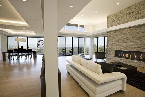
1) Maximise Natural Light,
Natural light is the best source of light for your home, it is the best light for your eyes and the most environmentally friendly light source. If used properly effectively it can transform your space. 

Top Tips:
If you are extending consider adding rooflights to help light inner rooms.
Where you lack natural light cheat your way to second window with a cleverly placed mirror.


Light and Airy Lounge Pulltab Design Duplex, NYC... Fabulous!

2) Imitate natural light
If you can't get natural light into your space then imitate it. There are some very clever LED lighting systems that can allow you to create floating surfaces that create the impression of reflected natural light from a high level.


3) Create Ambient Lighting
Ambient lighting needn't be complicated; It can be as simple as a few well positioned table and floor lamps that when switched on alone (without overhead lighting) create a more intimate lighting level.

Ambient Lighting from VICTORIA HALE: A PLACE TO ENTERTAIN

4) Create Intimate Lighting
Reducing the level of a light fitting over a seating or dining area can create a more dynamic lighting scenario in the home and a more intimate feel to your space. The image below is a design by Matha O'Hara Interiors

Image by Martha O'Hara Interiors

5) Play and have fun
Experiment with lighting, buy portable funky fun pieces that can be moved around. Lighting is the most functional and most effective onrnamentation in my book so I say indulge your home and flood it with light.

Image Above by Graux & Baeyens Architects, 6 House Design


Watch out for these techniques in my schemes for more ideas...


Thursday 31 October 2013

Getting the most out of [Your] Place Step 1: The Client Brief

I have been a bad blogger, since we moved house I have struggled to publish anything [although I have drafted lots]

I’m not one for excuses but I have had a few reasons; I have been working non- stop since the move on two projects Valarie Howes: A Place with a View which is soon to be completed on site and Caroline Sydney- Payne: A Place for Family soon to commence on site.

Today is the first time I have had a moment to start considering [Our] place.

This post will be the first of a series which, start at the very beginning and, use our new place to demonstrate the my processes and what can be achieved.


Step 1; The Client Brief

The first step is the client brief; The client brief is the most important phase of the design process. Really thinking in detail about how you use your existing space, what you aspire to for your home or place of business in the immediate and foreseeable future will help you plan your home in the most efficient way.

Determining your client brief can be tricky, there is a lot to consider, the steps below are the approach I recommend to really get to grips with what you want to achieve


1)Dream House/Business Wish List (Get Pinning)

The Dream House wish list might seem fanciful when you first start but with a bit of foresight and planning you can usually incorporate the most important aspects of your dream home into reality and most importantly it helps you to prioritise your requirements. Pintrest is amazing for this. See [Our] Place: Planning Our New Home here and my Client Board for Caroline Sydney here and you can follow me here


2) What have you got?

Really look at your existing space; What have you got? Which areas work well? Which areas need improvement? Where do you like being and which rooms leave you cold? Which areas are underused? Can you keep and update existing furniture with new doors, paint or door handles?

3)Flow and Interaction
 
Try to think of Your Place as a whole, the way you use and move between spaces and they way they interact. Can you identify any areas which are underused? Any areas which aren’t suited to the ways you use them?


4)Function

Function is the base of a good space; think about what your space needs to achieve? Who lives here? What happens here? Where is you natural light? Do you need a home office? Do you need a single open plan flexible space for entertaining/ working/ playing? Do you need a separate play room for the kids? Think of how you would ideally like to use your space and you  will very quickly start to identify ways to make your place work for you.


5)Details

Where do you want to light? Does your house have enough power/ telephone sockets? Do you want to integrate surround sound? Are light switches on the wrong side of door openings? Will you furniture layout clash with your radiators? Paying attention to the little things you use every day will make a huge difference to your enjoyment of the space when its finished. If you are planning to have work done this can be an excellent integrate or adjust services.


6)Future Proofing

Its an overused term to encourage you to try and predict your future needs and, where practicable plan for them... which leads us nicely into...


7)Budget & Phasing Work

Plan a budget and stick to it, then prioritise your requirements and get them costed.

This will equip you with the information to make decisions and phase work if necessary. There is nothing worse that completing a room, only to realise you need to knock a whole in the wall for your next project.

You may find the 'Dream home' will require phasing to make it affordable; But if you know where you want to end up it will be easier to plan and phase your work in a logical way that will save you time and money in the long run.


Get clear about all the points above and you will have arrived at the [often elusive] Client Brief

Happy planning!


Wednesday 21 August 2013

Caroline Sydney-Payne; A Place For Family

'Family' was the definitive term when designing Caroline and Billy Paynes extension. This design is all about sharing and creating a space for everyone to enjoy ...
  
Like every modern family, Caroline's is a busy one. Two children of primary school age, activities and a business at home mean that the family space works hard to provide everything required.

The scheme revolves around creating a unified space with the flexibility to multi-task and provide the family with places to play, work and study on the ground floor.
 
We started with a range of sketch schemes, mood boards (below) and a lot of Pintrest Action which you can see here.
 
 
The Layout
The design extends the open plan living area, by infilling a courtyard, to create space for a new kitchen (open to the living area).


To gain as much natural light as possible for the space and to add that 'wow factor' we added a roof lantern to the flat roof area. This is to flood the kitchen with natural light and create as much borrowed light as possible for the existing dining area, new study and utility room.

To allow natural light and ventilation, into otherwise internal rooms, we designed in two roof lights to the utility room and proposed study/ 4th Bedroom and used glazed doors between rooms.


The kitchen design incorporates a breakfast bar to allow the children to be able to sit with Caroline whilst she is in the kitchen whilst keeping them out of harms way. Rear glazed doors open into the garden to create an easy connection between the internal and external spaces.

In the dining area we created flexibility with an extending table that can be moved into the centre of the room when a larger number of people need to be seated and used a large wall mirror to reflect natural light from the kitchen extension into the dining area.


The dining area doubles as a play area and built in storage houses the children's toys and books in tubs so they can be easily cleared away for dinner.

The lounge has been refocused on the fireplace in the centre, a large corner sofa looks inward toward the fireplace (TV wall mounted above) and beyond to the open plan living space. An arm chair allows the seating plan to be easily reconfigured for more social occasions.


The new kitchen allowed us to use the floor area to provide a new study, utility room and extend the existing downstairs WC to form a wet room and shower.


The Finishes 
 The interior finishes and furniture have been selected to create an eclectic mix of traditional tones and forms with a modern injection of pattern and bright colour.

The chandelier light fittings are centrally positioned in each of the three distinct spaces to visually link the open plan living space. The same themes and shades have also been continued in the finishes to connect and distinguish the different uses.

Continuous floor timber effect floor finish, broken with a rug in the lounge, create a high end seamless look to the space and increase the visual impact and feeling of size. The area of decking outside will have boards orientated the same way to and at the same level to continue the visual connections to the space outside.

Tuesday 20 August 2013

[Your] Place: Colour Crush

Farrow and Ball are my 'go to' company for paint inspiration, the depth and warmth of the colours makes them head and shoulders above the competition [in my eyes].
 
Because the range has a grey colour base, the shades complement each other exceptionally well... 'if in doubt, head to Farrow and Ball!'
 
A while ago they launched a competition for a new paint colour; they've whittled the choices down to 20 which you can see here.

Now I don't want to unduly influence anyone but I am besotted with Line Knot (and quite infatuated with Mustard and Pink Paloma)... 


I feel a scheme coming on...
 
I'll keep you posted.
 

Saturday 17 August 2013

[Our] Place: The Old and The New

Exciting developements at [Our] Place we have moved!

Now aside from having a whole house worth of new projects to design the impending move has also made me reflect on what we have achieved in this house.

The following are a few images of the before and after shots of the rooms we have did in our previous house:


Friday 2 August 2013

VALERIE HOWELLS: A PLACE WITH A VIEW

Mr and Mrs Howells breed rare sheep and rams and had a small one bedroom cottage in need of modernistaion throughout.


Walnut Lodge prior to remodelling
 
 The scheme includes a single storey extension to provide an open plan living area with views over the adjacent fields that hold their livestock, internal remodeling to provide an aditional bedroom and new bathroom.


Views from Southern aspect over adjoining fields


We also reclad the entire property in Eternit Cedral Weatheboarding, a maintance free material, which completely transformed the property inkeeping with the countryside asethic and allowed us to update and improve the properties insulation to meet modern standards.


The connection to the outdoors was paramount to the client and with the house in such beautiful surroundings we included roof lights and open eaves to the open plan living space. Off of the living space are two fully glazed french doors which open to the southern aspect and take in views of the surrounding fields.


The project is nearly complete on site so watch this space for completed photos...

Saturday 30 March 2013

[Our] Place: A Place to Dress

My other half will whole heartedly endorse that my clothes, accessories and cosmetics are a major contributor to the lack of organisation in our room. My having to look for things when trying to get ready constantly leaves "us" running late.

The new house allows a little more room in the Master Bedroom and the potential [fingers crossed] to extend to create an en suite and dressing room, which in my book is the ultimate luxury.

Dressing rooms aside, I am very excited about the potential for my first dressing table.


Slone Dressing Table by Marks and Spencer

Elysee Dressing Table available at Very

Marilyn Compact Dresser by Dwell

Habitat Perouse Dressing Table

Ikea Hemnes Dressing Table

Ikea Stockholm Console Table

Ikea Stave Mirror


Getting dressed has never been so much fun!
 

Thursday 28 March 2013

PERIWINKLE COTTAGE: A PLACE BY THE SEA

The town of Aldeburgh on the Sussex coat is an idilyc and exclusive spot for weekend and summer breaks. The area is full of seaside charm and attracts people from all over the country.

This project was the renovation of a property purchased as a holiday cottage investment by the owners.
 
Due to the popularity of the town the standard of holiday accommodation is high. The desired aesthetic was one of understated, rustic comfort with a nautical twist.
 
The palette of finishes was kept muted and light, mostly white, stone and aqua with a red feature colour to keep things fresh and warm.


The front door opens into the lounge, complete with cast iron and ceramic open fireplace, the lounge opens onto the dining room which contains the stairs to the first floor. Following on from the dining room there is an extension which contains a kitchen and bathroom.
 
On the first floor there were two good size bedrooms, we utilised alcoves as storage and created a space saver en suite WC to the Master Bedroom.

The cottage is a stones throw from the coast and on Aldeburgh High Street.


Saturday 23 March 2013

Inspiration from Fashion: Monocrome

The pace of fashion seems, to me, to gather speed on a daily basis. The media today is an explosion of information, choice and concept sharing, which we can access 24/7... its incredible!

The interiors market seems to be following suit with trends emerging on an increasingly frequent basis, more magazines hitting the shelves and infinite numbers of emerging blogs showing what we can achieve in our own homes and businesses.

The choice is limitless.

Sometimes this can feel overwhelming.

In these cases I would advise sourcing inspiration to refine your options.

Fashion trends often influence interior design so to stay ahead of the game, and stay true to your individual style, apply the principles of your tastes in fashion to your interior projects. An approach whole heartedly adopted in Sugar Plum Slippers house.

The latest fashion trend to hit the high street is monochrome, the timeless combination of black and white, which to me calls out for yellow highlights:

 
Shelving Unit by Ikea

Wallpaper by Eco Wallpaper

Cushion By Jean-Paul Gaultier at Amara Living

Stockholm Cushion by Ikea

Grand Duo from Fashion for Home

Rug From Ikea

Lampshade from Not On The High Street

Tuesday 5 March 2013

[Our] Place: Lounge Update

Whilst taking photos of [Our] Place for the blog, and mentally comparing them to the schemes I'm currently designing, our house came up short, very short.

The Lounge was one of the first rooms we did and on a tight budget. Five years on and our hand-me-down table and chairs are beyond tired, our 'cheap as chips' sofas are sheading bolts faster than our dog sheds fur and our mis-matched storage is cramping our layout. This is not the home of a interior design business.

However we are planning to move house soon to a place that we can really develop the way we want to with extensions and knocking out walls, so I'm not going to start replacing all the furniture just yet.

In the interim I am planning a few minor updates to maximise the impact with items we can take with us when we move.

The red tones and pattern of the feature fabric [a hug piece of remenant fabric which made two curtain panels, covered six dining room chairs, made two cushions and customised a nest of coffe tables] from Feran Fabrics need updating.
The Theatre Spread, in the John Lewis magazine, featuring metallic lighting spurned my recent metallic obsession and I find myself focused on bringing out the subtle metallics in the Graham and Brown feature wall paper, which I still absolutley love.
The Theatre Spread from the John Lewis Magazine
I intend to do this by replacing the ‘upcycled’ coffee table nest, incorporating the deep pink paint and the red feature fabric and replacing them with, what I consider to be a brilliant and very reasonably priced white coffee table nest from Habitat.

The Kilo Table nest is a sleek thin oak frame with a formed powder coated metal top give the apperance of a modern product with a nostalgic nod to 1950’s design. Kilo is avliable as a nest of three or a single table which allows us to inject a bit of symmetry into the lounge and have plenty of flexibility for when guests come round.
The tables are avliable in a range of colours, we have selected white to echo the white in the light fittings we installed when we first did up the lounge which also have a bit of retro appeal.

To make the space feel larger and seat more people we bought an Poang Arm Chair from Ikea for £55. Its so light and versitile we'll be able to find it a new place in which ever home we end up. It is now Milo's favorite new spot.

To accessorise the scheme I bought a neutral dog tooth pattern throw from TK Maxx and the Yves table lamp from Habitat with Grande black and copper lamp shade, also from habitat.
At a total cost of less than £300 the lounge updated has neutralised and updated the lounge ready for potencial buyers.

This is the joy of designing in a neutral base, something I often encourage clients to do, it’s easy to change and won’t break the bank, which is especially important if, like me, redecorating is a professional hazard.

Wednesday 9 January 2013

VICTORIA HALE: A PLACE TO ENTERTAIN


OPEN PLAN LIVING:
Victoria is a born [and professional] events planner.  A social butterfly, there is never a weekend when she is not hosting or attending a fabulous event [read about them here]. 

Whether its dinner parties, afternoon tea or full blown Halloween and New Years Eve Parties she does everything with up to the minute finesse,  so when designing her open plan living area, creating a flexible venue for entertaining was key to the brief.

Victoria is into all things current and lifestyle, and already had some strong concepts for the design. The desired tone was  neutral but sophisticated with a touch of glamour. 

Through discussion we agreed that a tonal scheme with a high end New York loft-vibe would provide the perfect base for Victoria's quirky colour pop and vintage inspired accessories.
The space planning concept was developed to emphasise the strongest aspects of the existing spaces and draw together influences to visually link three living areas. Each area  planned according to function [the Living Room, Dining Area and Conservatory] remain distinct but can also become a single space for entertaining on a larger scale.

Conceptual Mood Board for Victoria

The positive qualities and flow of the existing space inspired the selection of finishes, furniture and layout of the lounge/ diner and conservatory. The scheme is focused on accentuating the length of the open floor plan and good natural light that spills into the space from either end.
The conservatory at the rear of the lounge-diner room creates a diffused white light which draws the eye to the end of the space. To replicate and echo this effect in the lounge and dining room we used large white light fittings from Next to create the same diffused white light.
The size of the light fittings, which are half a metre in width, work in the proportions room. The height of the fixture, fitted close to the ceiling, exaggerate the height of the space. 
View from the Lounge Area through to the dining room and conservatory
A neutral palette with a sense of opulent texture and a hint of metallic sheen was selected as the perfect backdrop to Victoria’s strong sense of style and love for vintage inspired and colour pop accessories.
The finishes were kept to a simple palette of complementary tones, with textured and gloss finishes selected to add depth and a sense of opulence. 
The paint colour is from the Dulux heritage range and matches the darker tone of the wall paper, Laura Ashley Lille Truffle Stripe Wall Paper, exactly. The tone is muted and warm and provides a subtle and crisp contrast to the white, skirting, ceilings and storage furniture.
The laminate floor, the same tone and shade as the dining table, provides a continuous finish throughout the room and draws the eye down the space making it appear more spacious.
Dining furniture and accessories and the lighting used throughout the scheme
The subtle metallic tones of the Laura-Ashley wallpaper were reflected in the satin silk curtains hung in the dining room. The stripes provide interest to the walls and the broad pattern is modern take on a classic style.
The neutral stripes are carried through, from the lounge, to the dining room with a table runner to create aesthetic flow.

The dining room side board [Ikea Besta; System] perfectly accessorised by Victoria
Lighting is crucial to good interior design, clever placement of floor and table lamps can make a room appear larger when brightly lit and create an intimate atmosphere when low level lighting is required for entertaining.
Lighting can have a great effect on the mood of a space so we included a selection of lighting in the scheme to allow variety in the atmosphere created. Lamps and lighting are a great way to introduce ornamentation with function.
White gloss storage furniture in both the lounge and dining room keep clutter to a minimum and provide light reflective surfaces reflect light and display accessories and lighting. The TV stand was sourced by Victoria from Dwell and the dining room sideboard is from the Besta range in Ikea
The chairs, Tobias from Ikea, add a modern edge to a classic dining table. The transparent seat means that they can be regularly updated with cushions and fabrics if required. They are comfortable, well designed and very good value and may be featuring in our dining room update very soon. 
View of the lighting in the lounge and dining room and the conservatory furniture and accessories.
The conservatory has been finished all in white to maintain and increase its luminance. White sofas and a pale floor finish make you feel as though you are stepping out into a white winter morning after a fresh snowfall. Victoria has finished this room with soft white throws which makes afternoons in the conservatory feel like wiling away the afternoon in the clouds.
The hot pink feature colour which has been used sparingly throughout makes a final appearance in this room to draw all the spaces together.
This scheme is an excellent example of how a high end look can be achieved with high street furniture and finishes when a scheme is considered, in its entirety, from the outset.
At YPYR we believe that no matter what the budget or the list of requirements with a little bit of thought your home or business can work as hard as you to improve your quality of life.